
Minnesota United FC
Creating a world-class soccer brand that’s uniquely Minnesotan.
The work
Pro soccer boasts a five-decade history in Minnesota, but back in 2012 it faced an identity crisis. For years, local fans followed international teams more than their own. When the Minnesota Stars were came under new ownership, the club needed more than just a new look—it needed a brand that would capture the state’s essence and rally passionate fans. Our task: to build an identity that would redefine Minnesota United and create a fan experience that reflected the spirit of the North.
Our roles
- Audience Segmentation
- Brand Identity
- Category and Customer Insights
- Creative Platform
- Engagement Strategy
- Environmental Design
- Pitch Materials
- Signage & Wayfinding
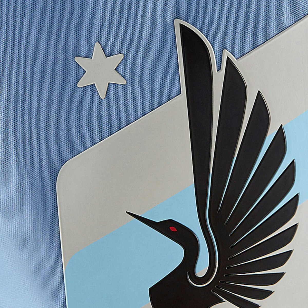
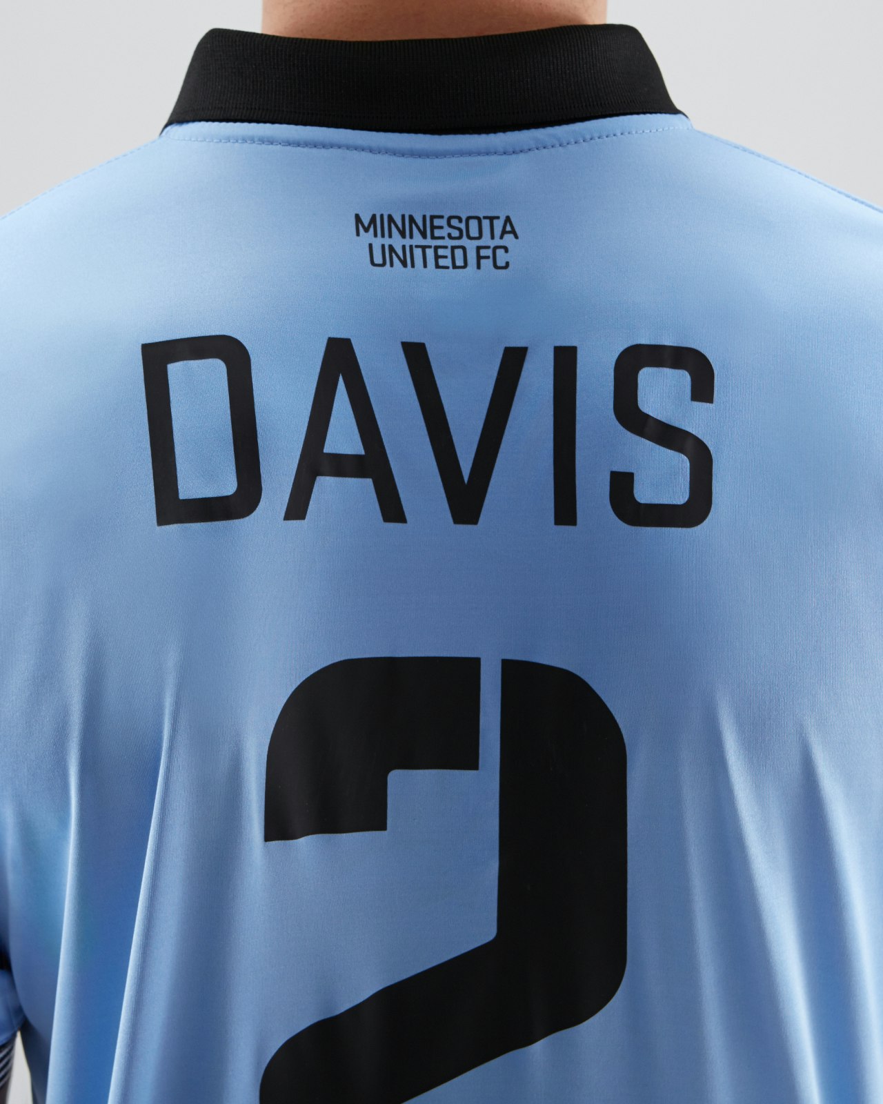

The Opportunity
Designing an identity that embodies Minnesota’s spirit.
Partnering with the club’s new ownership, we set out to craft a visual identity that was as iconic as it was rooted in Minnesota. With only three weeks until the new club’s introductory press conference we quickly got to work exploring the state’s symbology and cultural associations to find deeper meaning we could build into the new identity.


Avoiding the clichés of American sports branding, we instead opted for something that spoke to the authenticity of the state. The key elements we developed, from the majestic loon (Minnesota’s state bird) to the North Star and the silver taconite plates symbolizing the state's mining heritage, wove together a story that resonated deeply with fans across all demographics.
When the opportunity came for the team to join Major League Soccer, we worked directly with the club’s front office to create the winning pitch.
“If Minnesota United is the next MLS expansion team they will immediately have the coolest logo in the league.”
Soccer legend Alexi Lalas, 2015

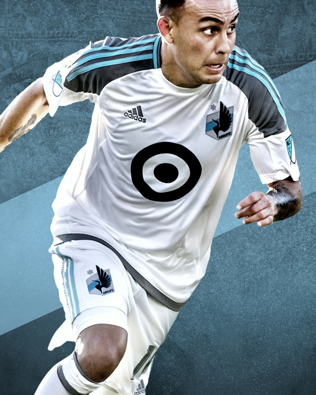
Our Approach
Creating a brand that gets stronger through participation.
We imbued the team’s crest, uniforms, and the brand identity with rich meaning that empowered fans to take ownership of the club’s identity. The most passionate supporters have reinterpreted our designs, adding their own flair and energy, making the brand even stronger through participation.
Years later, we returned to those same themes through our work for the club’s new home at Allianz Field. Beyond just branding, we crafted moments in the fan experience—from signage and wayfinding to community engagement—that created a fan experience like no other.

“Traditional brand identities are perfected at launch but degrade over time with use. With Minnesota United, we flipped that by creating a brand that grows stronger as fans make it their own.”
Brad Surcey, Designer and Partner at Zeus Jones

The Outcome
Transforming a soccer club into a cultural icon.
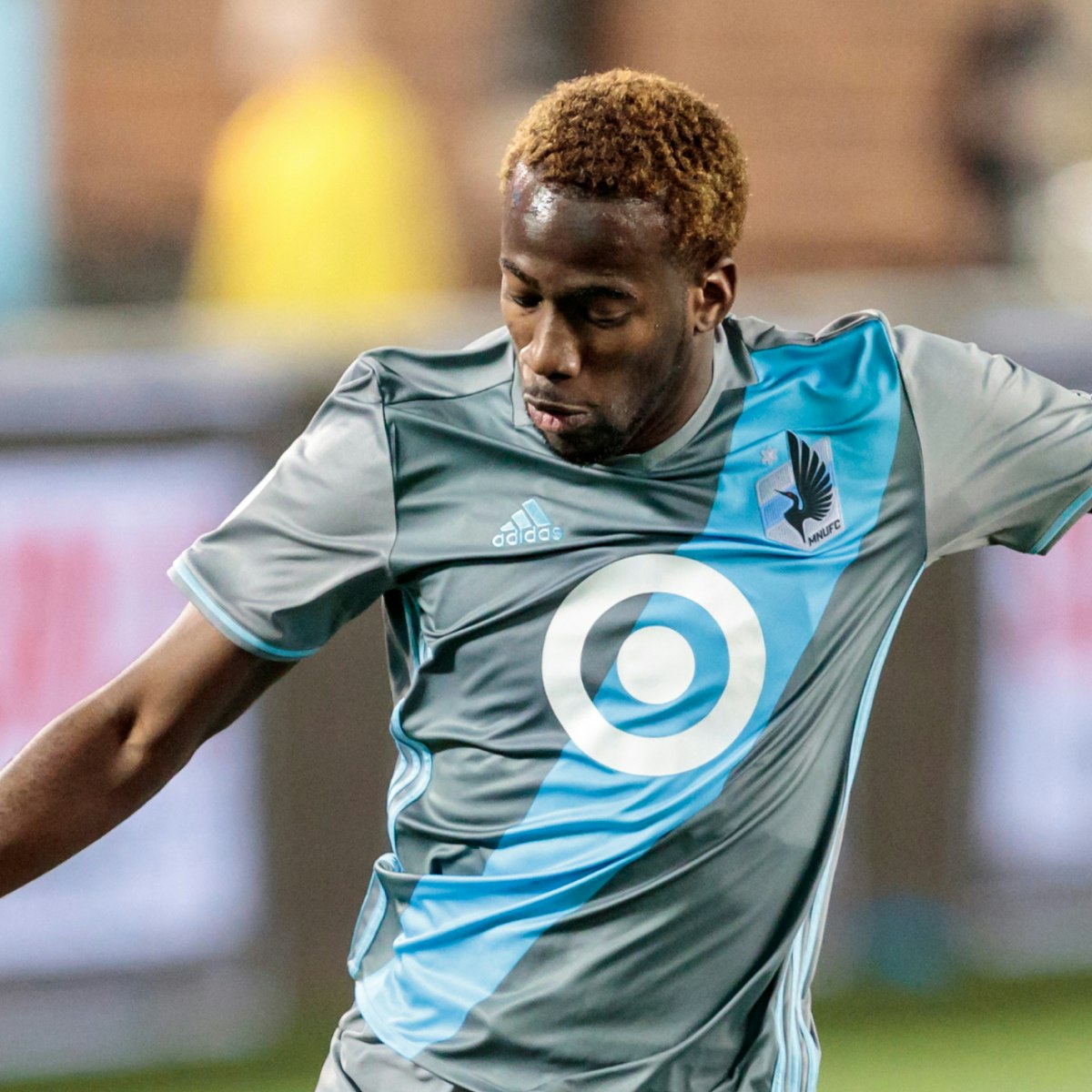


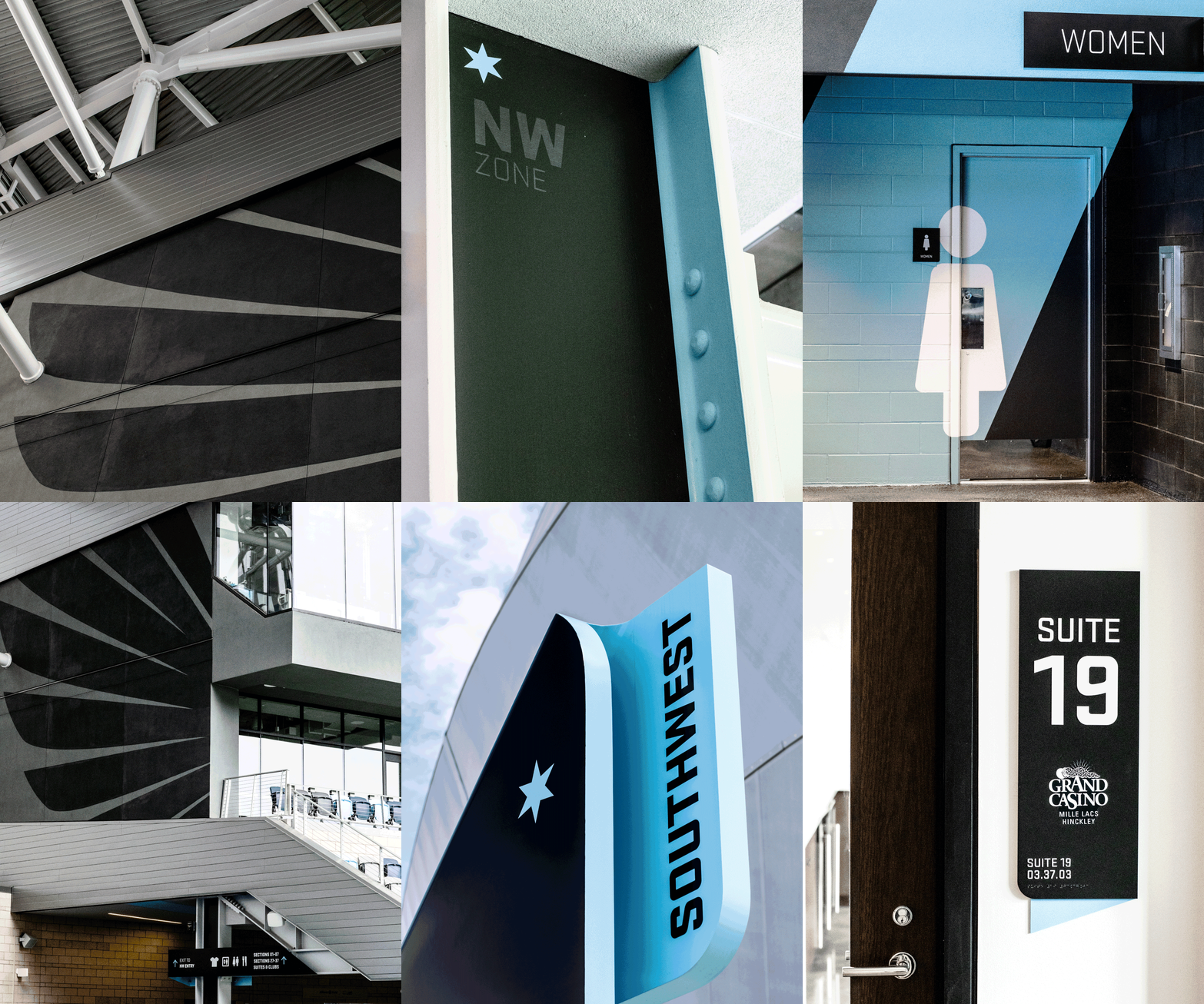
Minnesota United’s rebrand was a resounding success. The crest was hailed as the “coolest logo in the league” by soccer legend Alexi Lalas and won “Best MLS Crest” on Reddit, solidifying its place in the hearts of fans. Allianz Field, designed with a focus on fan experience, has been recognized by USA Today and ESPN as one of the best MLS stadiums.
The branding has not only elevated the club’s status in soccer but has become a symbol of pride for the state itself, proving that a great brand can inspire community and transcend sport.

Our team
Ben Olsem
Brad Surcey
Brian Danaher
Elsa Perushek
Grant Wilson
Joseph Kuefler
Alex Register
Emily Ryan
Missy Reinikainen
Our partners
Matre Photography 📷 👕
Populous 🏟️
Bakar Elmi 🎥 🏟️
Rachel Hardacre 📷 🏟️

